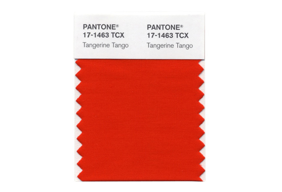
Is it only Brits who know what that means?! If so, and you aren’t one, I’m sure you can find it on Youtube, but you’ll probably be none the wiser! You might guess that I’ve been looking at Pantone’s colour report for this season. When I was making beads I always used to get stuck trying out new and innovative ideas, tending to return to tried and trusted, combinations, or rather, those that I loved, which in my case tended towards the blue, purple, teal, aqua end of the spectrum. So when I saw that Pantone had picked out Tangerine Tango (17-1463) as their colour of the year, I was interested, because this is a colour that would normally scare the life out of me. What does orange say after all? 1970s wall colours; Southwestern style jewellery; Irn Bru; celebrities who’ve had a run-in with the fake tan, and yes, that ‘you’ve been Tangoed’ man from that ridiculous advert.
And then I thought, actu ally this shade of orange is closest to Hessonite Garnet, of which I sell rather a lot; a deep, burnt orange as opposed to a really bright in-your-face orange like, say, Carnelian. Pantone themselves describe it as “a bit exotic, but in a very friendly, non-threatening way”, which got me to thinking about what might go with it.
Purple and orange is an obvious one, I guess, like a sunset; the colours a bold pairing that would work year round – intense and Mediterranean in the summer, and cosy and rich in the winter. I don’t know if I’d be brave enough to wear it in an outfit, but jewellery, yes definitely. Above is hessonite garnet 6mm rose cut round and Brazilian amethyst 6mm rose cut round.
I then thought to myself; what colour would I never, ever put with orange? Got to be pink, but but I love this combination (right); it’s just fab! Here we have hessonite garnet 6mm round with rubellite tourmaline 5mm round and pale pink tourmaline 6mm round. It’s not like pink with bright orange, which would be a bit much; here the bright pink of the rubellite contrasts really well with the burnt orange and the whole thing is tempered beautifully by the pale pink tourmaline. This is punchy and unusual without being brash.
Finally, this shade of burnt orange is just the kind of colour that will work really well with neutrals. I tried it with some pearls; left we have hessonite garnet 4mm rose cut round cabochons with white freshwater pearls, 4-5mm half drilled buttons. Warm, subtle and sophisticated, this is an elegant combination that will look great with summer neutrals; ivory, cream and beige linens and so on. Again I can see it working across seasons, adding a warmth and glow in the colder months. I love the combination of textures and the way the light plays off them; the lustre of the pearls and the sharp, faceted edges of the hessonite.
All of the above stones are available from my shop: www.joopygems.com.


