I was just reading through The Guild of Jewellery Designers jewellery trends report for Spring/Summer 2012 – here if you’d like to read it for yourself, and was really interested because it echoed something that has been on my mind for a while. The author (Jayne Coulson) describes a move away from the big, bold excesses of the past couple of seasons towards a more crafted, considered and creative approach. The word she uses is ‘integrity’. I’ve been thinking about that as I’ve found myself looking much more carefully at costume jewellery over the past couple of years, as my own business has grown. I’ve always been surprised at, well, what you don’t get for your money. It’s quite common to find base metals and low-grade stones for high prices, even for the more exclusive brands. Now, I don’t know the production costs attached to large-scale manufacture, which must be quite high, but I have this idea that anything over around $150 ought to be made of solid silver, with proper, good quality stones. And this seems to me to be the strength of the smaller, artisan jeweller, who can control this much better, select their materials and work to a smaller scale. The consumer therefore gets that much more for their
  money. More creativity, more quality, more value.
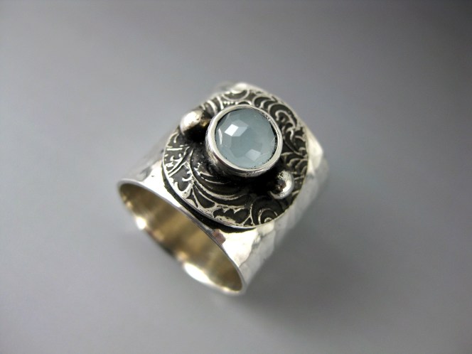
In her article, Jayne Coulson describes a return to line and form, as designs echo the asymetric lines and curves of tailored clothing, a trend for ocean-inspired organic pieces and a return to lady-like dressing (I have a fab line in pearls in my shop!!). Also, there is a renewal of interest in handmade finishes; hammered, engraved, brushed and granulated. Above left is Marsha Drew’s Riptide bracelet, made from fold-formed sterling silver (part of a larger collection), and right are a pair of embossed sterling silver earrings made by Petaluna. I adore both of these pieces; the spareness of the design and the creativity where fascinating and complex forms have been wrought from a simple piece of sheet silver. In these straightened and uncertain times, there seems to be a move towards integrity of build and design; pieces driven by a thoughtful design process, made from materials that are worth something and will stand the test of time. Anyway, what do you think?


