Spring Colours: Emerald

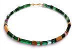
This is Pantone’s colour of 2013; a pleasing shade of blue-green, soft but with enough vibrancy to pack a punch. I remember when green was considered an awkward colour, difficult to wear. Times have changed and even if green still makes you nervous, jewellery is a good way of adding an accent of colour; dipping your toes in without getting completely soaked! The colour has also seen a rise in popularity in jewellery in recent years with the growing awareness of stones like chrysophase, which can make an excellent opaque emerald substitute. Emerald itself can be difficult; whilst it is indisputably beautiful, it’s expensive and I’ve seen the price of even lower grade opaque material soar over the past few years. Cheaper transparent material may be brittle and included, and rather lacking in lustre and so a more cost effective option might be the green and green-blue tourmalines. For vibrant green, chrome diopside is a good option.
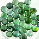
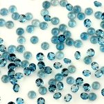
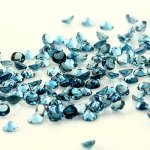
3mm EME cab round 1SLTW103 34mm cabochon round11Tourmaline blue green cabochons 4mm round

In this colour range I have a selection of emerald cabochons, tourmaline and chrome diopside, plus a number of watermelon tourmaline slices in hard-to-find shades of blues and greens, available at www.joopygems.com Whilst emerald is often paired with diamond, greens also partner well with warm golds such as citrine and purples; all shades of amethyst from pale lavender to deep grape.

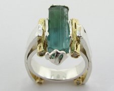
I’ve got a Pinterest board with a huge selection of jewellery in this colour range. To pick out just a few (which is hard!), to the right is a ring from Wexford Jewelers; the Emerald and Diamond Wedding set, in 14k yellow gold. To the left and below is the ‘Skyscraper IV, Destroyed. A tourmaline rough ring’. This is a fantastic natural bi-colour tourmaline crystal set in silver and 14k gold with diamond accents. I love this; you can see the natural crystal formation on this along with the growth marks. Wexford Jewelers are based in Michigan in the USA; a team of three sisters who, in their own words, ‘create a bouquet of exquisite pieces using recycled silver & gold, exquisite rough and polished gemstones, re-purposed diamonds, and rare minerals’. Unlike most other small-scale jewellers, they use the method of lost wax casting extensively in their work, carving their designs from wax first before having them cast in metal, lending a fluid and dynamic quality to their work. You can visit their shop here.
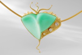
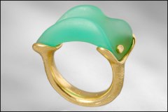
Charmian Harris is a British based designer, who cites early Greek and Roman jewellery as well as Egyptian jewellery as among her influences. She cuts and shapes her own stones and handpicks each one from collectors, dealers and sometimes direct from mine owners. I would imagine that this is extremely liberating for a designer, not to be bound by existing shapes and cuts. Certainly, Charmian’s work displays a striking fluidity and individuality; solid rock appears to flow in fantastically imagined forms. To the right is her Sea Creature pendant made of 18 carat gold, chrysophase, white sapphire and diamond. I love the shape and the sinuous lines of this piece; wonderfully tactile. To the right is her 18 carat gold ring with chrysophase; a form that appears organic and living with its curving lines and textured metal. You can find Charmian’s website and shop here.
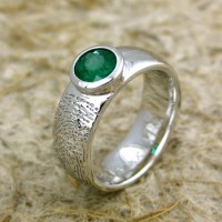
Here’s something a little bit different: to the left is Adzia’s Fingerprint Wedding band. A unisex band with a fingerprint and a gemstone, Chicago-based Adzia makes these to order, so that you can wear your beloved’s fingerprint wherever you go! To the left is an example in 14 carat white gold set with a natural emerald, but you can choose your metal, your gemstone and your finish. A very unique way of sealing your relationship, and not only do I like the idea, I also love the look of this – I adore textured metal! Adzia has a whole range of fingerprint rings, with and without gemstones; prints on the inside, prints on the outside, you name it! You can find this ring, and more examples of Adzia’s work here
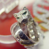
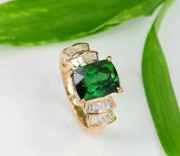
For a spot of sheer glamour, why not have a look at Hong Kong based designer-maker Steve Cheen’s work? Steve’s work is complex and highly detailed, despite handmaking each piece. To the right is his Jaguar Engagement Ring, made from 14K white gold with emeralds and diamonds. To me this is reminiscent of the 1930s with its curving lines, pave setting and intricately imagined jaguar head, the kind of elegant piece that might have adorned the finger of Wallis Simpson. To the left is his 3.2 carat green tourmaline ring set in 14 carat gold with diamonds. Again, the channel set diamonds lend traditional glamour, and the green tourmaline is spectacular. Steve will design to your specifications, and treats each piece as an individual artwork. For other examples of his work, you can find his shop here.
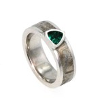
You can find more examples on my Pinterest board , below a selection, from left to right: necklace made of paper discs from German-based Dorisse at Paper Statement, Dior Fine Jewellery’s fantastical le Bal des Roses bal d’autrefois ring in white gold with diamonds, emeralds, chrysoprase, green tourmalines, tsavorite garnets and paraiba tourmalines, British based Louise O’Neill’s 18 carat gold necklace with green and pink tourmalines, and Jewelry by Johan’s Meteorite ring inlaid with platinum and set with a trillion cut emerald.

Spring Colours: Nectarine

Spring seems far away but this year has gone so fast I’m shocked. Over here in Hong Kong, Autumn weather can feel very much like Spring weather (warm, sunny, not too hot), a relief after the sweltering summer month. So it doesn’t feel too strange to be thinking about spring colours. I normally have a look at the Pantone colour report for each season, just to make sure that I’ve got a good selection around the projected colour trends, and it’s nice to have look to see what’s out there. I’m starting with Nectarine; a soft, warm orange, great for providing a bit of a lift in these troubled times. From a pale coral to a deep, muted tangerine, this is a colour that adds warmth to the complexion and cheers the spirits.

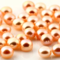
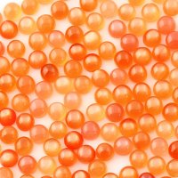
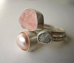
In this colour range I’ve got pink freshwater pearls at the softer, more muted end of the spectrum; full strings, half drilled and button pearls, find them here, and peach moonstone at the deeper, more saturated end, find it here. For a paler take on it, morganite has a wonderful translucency. This is a colour that responds equally well to the warmth of gold and the cool brilliance of silver, and would combine well with neutrals such as ivory pearls and white moonstone as well as forming interesting partnerships with brighter colours like emerald, turquoise, peridot. In its paler tones, such as morganite, I can see it working well with amethyst and a strong blue; sapphire or kyanite.

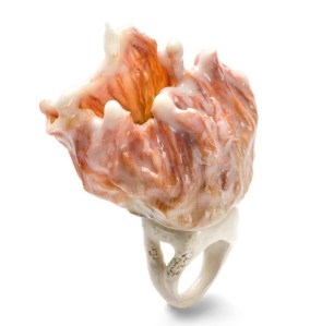
I’ve been collecting images of jewellery, which you can view on my Pinterest and here are a few of them. On the left is an amazing Adria Alic ring  from her ‘Flower’ collection, fashioned from silver and plastic. If you’ve never come across her work, you must have a look; she creates the most fantastical, dreamlike flights of fancy. Aiming to transcend ‘…the boundaries between jewellery, sculpture and visual arts’, she works with themes of illusion and lack of function to awaken people’s curiosity and challenge traditional notions of value in jewellery. Her work is mind-boggling, astonishing and you can find it here

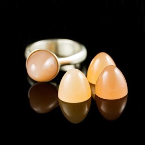
On the right is a ring from the LA designer nodeform. Created by an architect turned jewellery designer,  Konstanze design philosophy is for simple, sculptural forms with an architectural look. His work is clean and crisp, allowing the reflective qualities of the metal to enhance the flowing lines and overall harmony of the piece and endeavours to use reclaimed metal and ethically sourced gemstones in his pieces. Pictured is his Peach Moonstone Luna Ring, sterling silver with a bullet shape 11mm peach moonstone cabochon. You can see this and other examples of his work here

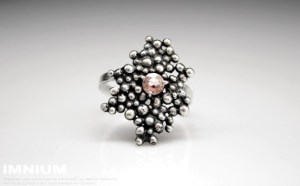
If you visit Ivona Posavi Pšak’s shop, IMNIUM, you will see that she claims to be ‘good at making jewellery, bad at writing about myself’. Whether she is right about the latter, I can’t really comment, but as to the former, I have to agree! Her pieces are organic, detailed and extraordinary. To the left is her Modern Organic Morganite Ring, made from hand-made oxidised silver beads and featuring a faceted 4.5mm morganite. You can find her work here, and be sure to check out her wire-wrapped work, which provide some of the most visually stunning examples of this technique I have seen, wonderful writhing coils provide depth and movement.

To check out what else I’ve found, you can find more on my Pinterest boards. I’ll be adding boards for each of the Pantone spring 2013 colours and am on the look-out for the weird, wonderful, beautiful and esoteric; drop me a line if you have something you think is suitable!

3mm Rose Cuts

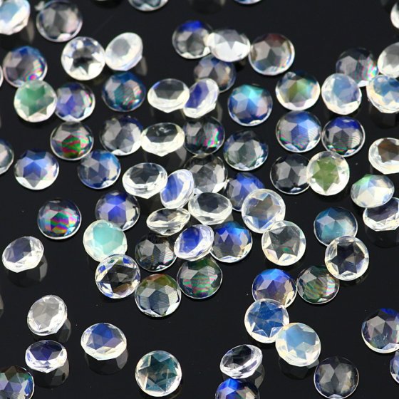
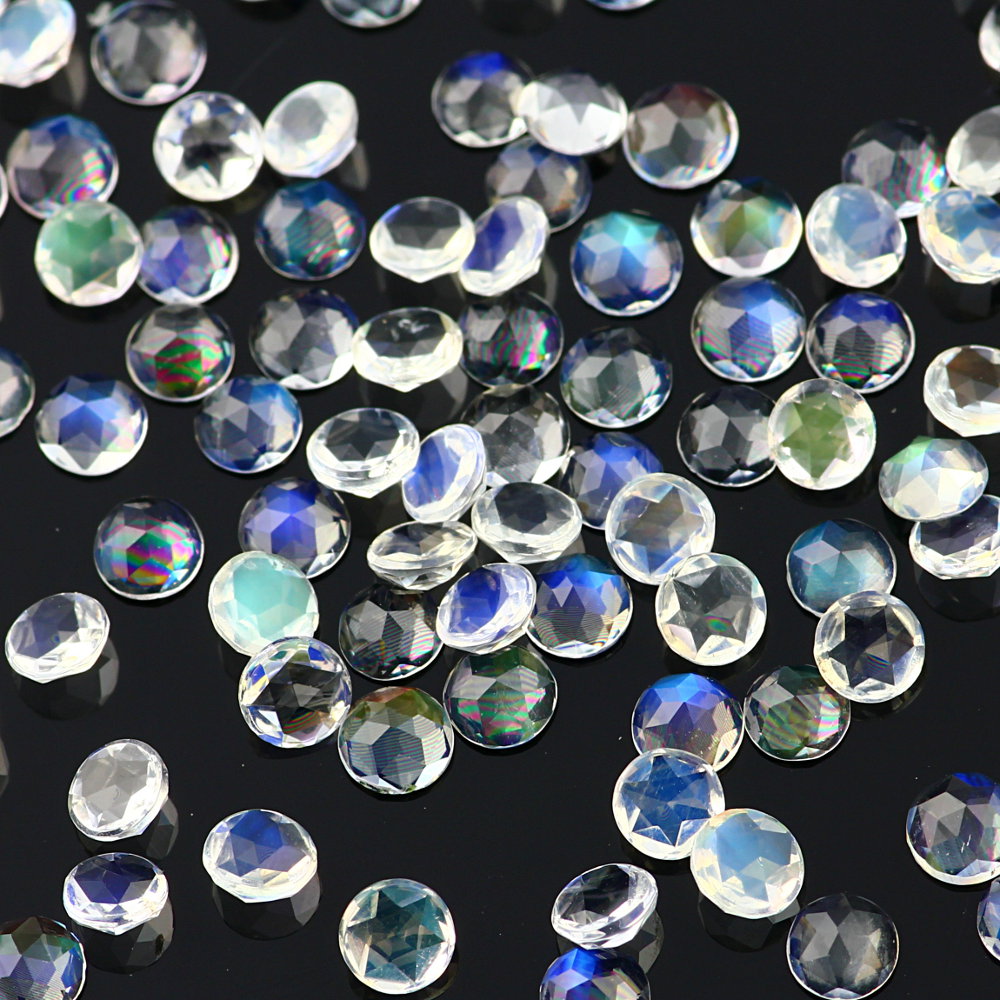
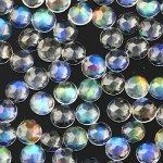
I’ve been asked for these often and so I’m really pleased to be able to finally offer them; 3mm rose cuts, beautiful glittering little stones. At the moment I have Rainbow Moonstone ($2.75) and London Blue Topaz ($4) but I am planning to offer them in a wider range of stones. The rainbow moonstone is high grade material, beautifully clean with a wonderful bright adularescence and the London Blue Topaz is vibrant even in this tiny size. Both very sparkly, both available at www.joopygems.com

Juicy Watermelon Tourmaline

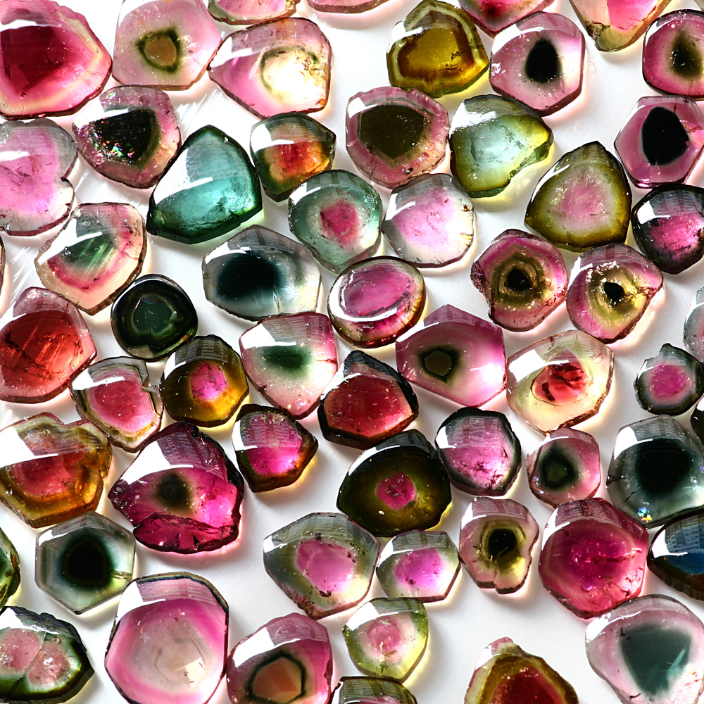
I’ve listed an awful lot of freeforms lately; opaque ruby, sapphire and labradorite. Coming soon I also have opaque emerald as well, and just in the last week, I have listed many, many watermelon tourmaline slices. Tourmaline is always popular, with its huge variety of colours, and this has been reflected in the price over the past few years, which has gone steadily up and up. I can’t do much about the price, but I do try to keep quality nice and high, and these slices are pretty clean for watermelon tourmaline, which is often highly included. They are absolutely gorgeous, in juicy, saturated colours, and I’ve got a huge variety in terms of shape, size, colours and price, including some rather rare and hard to source blue ones (several of these have already gone!). I also have a couple of pairs, which are fabulous for earrings. If you want to browse the collection, the relevant page on my website is here: http://www.joopygems.com/tourmaline-watermelon-slices/ . The last time I had these, they went pretty fast, and then I had no end of difficulty finding them again, so if you like them, grab them whilst they’re here!

page on

August birthstone

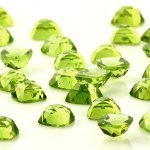
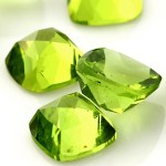
Peridot has long been associated with light and sun, and in fact the Egyptians called it the ‘gem of the sun’. Very apt indeed, (if you live in the northern hemisphere!) considering that it is the birthstone for August. There is something very sunshine-y bright about the peridot I’ve just listed, with its vibrant golden-green gleam. Apparently it is also thought to banish night terrors, especially if set in gold. Well, peridot does look exceptionally beautiful in gold, but for those of us that can’t run to that, silver offers a coolly lovely foil to its warmth. Just listed I have peridot in a 4mm and a 6mm rose cut cushion cabochon, available here: 4mm and 6mm

Welcoming back ‘old friends’

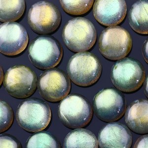
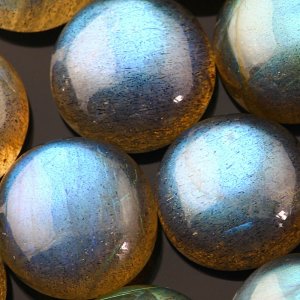
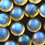
Finally back in stock I have some labradorite in sizes and cuts that customers have been clamouring for. These are labradorite 5mm round cabochons at $1.75 per stone, 5mm honeycomb faceted cabochons at $2 per stone and 6mm honeycomb faceted cabochons at $3.50 per stone. I am not quite sure what the problem has been with re-stocking these; I think it is just quite hard for my suppliers to get hold of nice quality rough. Such a lot of labradorite on the market is not nice; full of cracks with almost none of the highly desirable labradorescence. Since it is my opinion that a labradorite without good flash is like a blunt pencil (pointless) I’ve waited it out until now and finally I have some nice quality stones in large quantities, so I shouldn’t run out for a while! Feel free to buy like crazy!

Design and Integrity

I was just reading through The Guild of Jewellery Designers jewellery trends report for Spring/Summer 2012 – here if you’d like to read it for yourself, and was really interested because it echoed something that has been on my mind for a while. The author (Jayne Coulson) describes a move away from the big, bold excesses of the past couple of seasons towards a more crafted, considered and creative approach. The word she uses is ‘integrity’. I’veImage been thinking about that as I’ve found myself looking much more carefully at costume jewellery over the past couple of years, as my own business has grown. I’ve always been surprised at, well, what you don’t get for your money. It’s quite common to find base metals and low-grade stones for high prices, even for the more exclusive brands. Now, I don’t know the production costs attached to large-scale manufacture, which must be quite high, but I have this idea that anything over around $150 ought to be made of solid silver, with proper, good quality stones. And this seems to me to be the strength of the smaller, artisan jeweller, who can control this much better, select their materials and work to a smaller scale. The consumer therefore gets that much more for their Imagemoney. More creativity, more quality, more value.

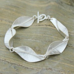
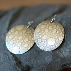
In her article, Jayne Coulson describes a return to line and form, as designs echo the asymetric lines and curves of tailored clothing, a trend for ocean-inspired organic pieces and a return to lady-like dressing (I have a fab line in pearls in my shop!!). Also, there is a renewal of interest in handmade finishes; hammered, engraved, brushed and granulated. Above left is Marsha Drew’s Riptide bracelet, made from fold-formed sterling silver (part of a larger collection), and right are a pair of embossed sterling silver earrings made by Petaluna. I adore both of these pieces; the spareness of the design and the creativity where fascinating and complex forms have been wrought from a simple piece of sheet silver. In these straightened and uncertain times, there seems to be a move towards integrity of build and design; pieces driven by a thoughtful design process, made from materials that are worth something and will stand the test of time. Anyway, what do you think?
Jewellery for the Soul


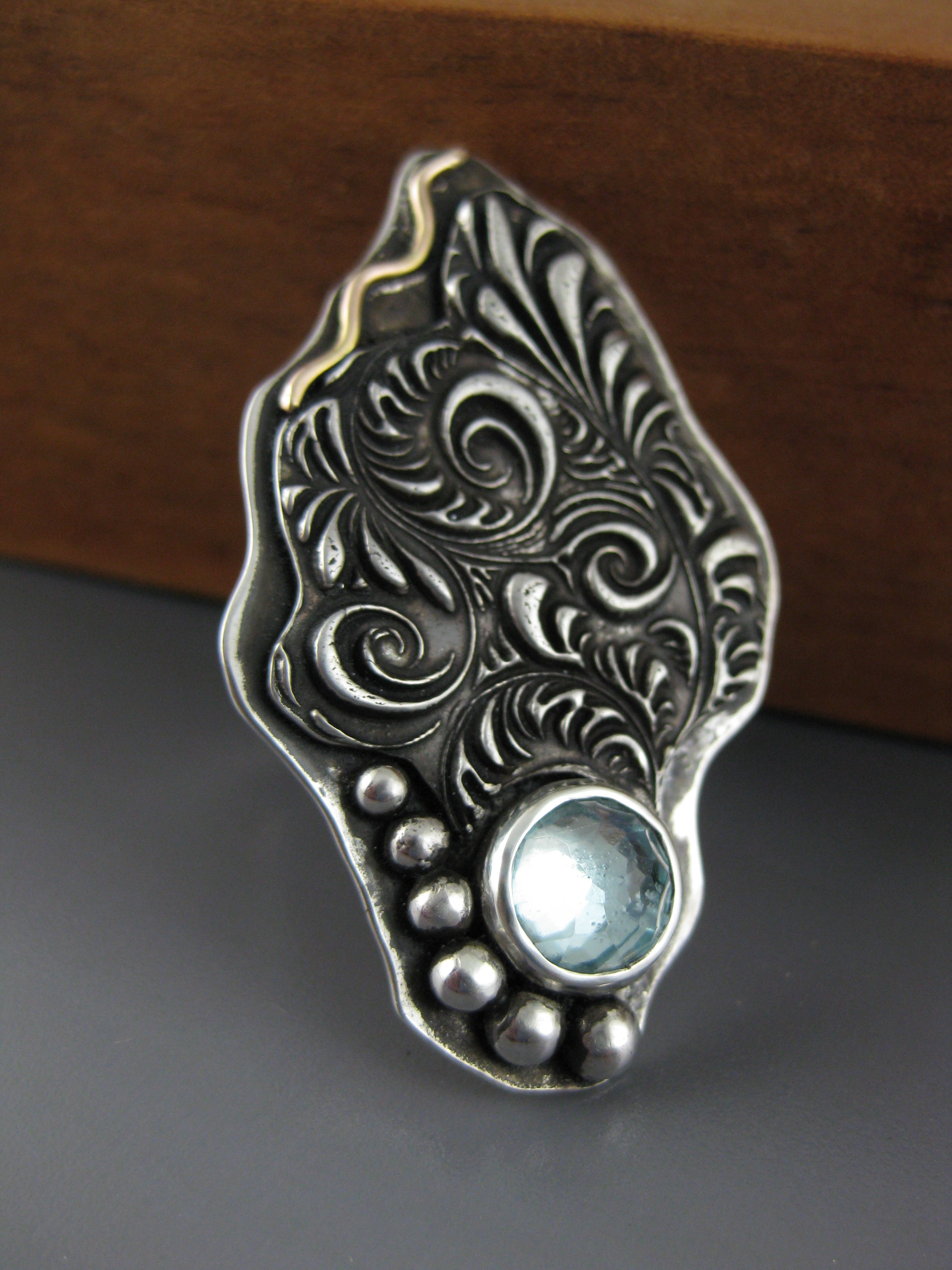
Stacy Low from Form and Funktion creates pieces of jewellery that are contemporary treasures; a unique blend of contemporary clean lines with ornate detail. She describes her creative process at its best as a state of ‘flow’ where she is ‘a vehicle for something that is pouring through me and bringing art to life.’ This sense where she, the creator, instead of imposing something on metal and gem, steps back and allows them to speak to her, engenders a sense of connection to the entire world. She herself states that her design philosophy embraces the idea that life is enriched by detail, and by the way that people notice the details in even everyday things. In this way, she strives for pieces with several layers of detail, ‘treats for the eyes’, so that every time you look you notice something different. This can be seen in this beautifully tactile silver and topaz ring (right) with its layering of textures, combination of polished and oxidised surfaces and judicious choice of stone. Both this and the silver and aquamarine ring (above) fascinate with their clean lines and ornate detail and cause the observer to look twice; are they heirlooms, or pieces that are utterly now? The truth is, a bit of both. You can find more about Stacy’s work as well as information about where to buy at her website, www.formandfunktion.com.


Photographing Blue Hues and Other Impossible Tasks….

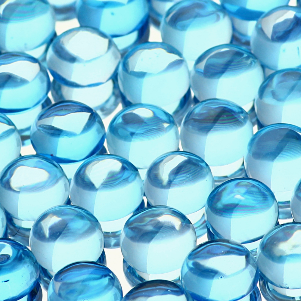
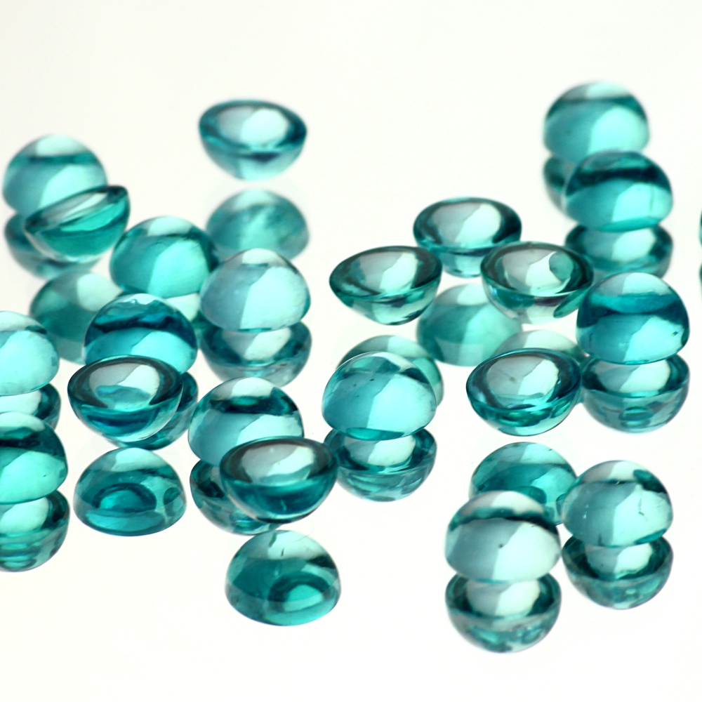
This looks like something Winnie the Pooh might write, in which case there should be a little song, but I won’t attempt that…! I have such difficulties photographing pale stones; the hardest being pale blues and aquas. Stones which are a intense, bright hue in real life, such as Swiss Blue Topaz and Apatite, turn out pale and washed-out looking. Pale stones such as sky blue topaz and aquamarine are even harder. One of my customers tells me that it is due to to the wave length of the colour blue and it is notoriously hard to shoot in print media. This sort of thing is common, pictured left are Swiss Blue Topaz 4mm cabochons. It isn’t horrible, but Swiss Blue Topaz is a very vibrant stone and this makes it appear soft and pale. In addition, the background is a murky greyish colour and there are bright white reflective patches on the stones. If I twiddle with the levels I can get the background whiter but then the reflective patches get very extremely white and the colours begin to look very unreal. I have recently developed a new technique – can anyone see what I’ve done here? These are Swiss Blue Topaz, 6mm cabochons (right), and Apatite 6mm cabochons (left), and here you can see that the colours have remained deep and intense. I’m much happier with these, as there are none of the white patches and the colour is much more true to life. My only problem is that the image is now quite stylised, and sometimes I suspect almost cartoonish. What do you think? I would love to hear from anyone who has the same problem and who has found a solution. If you share yours, I’ll share mine!

I’ve been tryi…

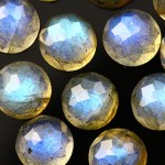
I’ve been trying for ages to work out the best kind of faceting for stones with a schiller; ie labradorite, moonstone etc. The issue for me is to find the faceting that works with, rather than against, the schiller, or at least does not fight with the schiller for attention. First of all I tried checkerboard faceting, and that was not bad; the problem being that it is a kind of faceting that is less popular somehow. Something to do with the regularity, or perhaps the fact that when you are setting it you have to get the facets lined up exactly right or the piece looks off-centre. Rose cutting was popular, but I always felt that it didn’t work quite as well; the cutting seemed to force the light in a certain direction that wasn’t always the best in terms of the schiller. So here is my latest offering;  honeycomb faceting.  The irregular facets glitter like mirrors when they catch the light, and they also allow the light to travel across the stone and pick up the schiller uninterrupted. The style of faceting also complements the organic look of the stone, so in short I think it works really well. I hope you agree; I have just listed 12mm, 8mm and 5mm labradorite with honeycomb faceting, and if it goes well, I will extend the faceting across the range. All three available in my shop – www.joopygems.com – and priced respectively $16.50, $5 and $1.50 USD